
Methodology
Built around your reports, not a generic slide deck
Most data communication training was written for people who already think in rows and columns. This workshop starts from the opposite assumption: participants know their subject matter well, and simply haven't been shown how to turn a spreadsheet into a sentence a busy executive can act on. Here is how the two sessions are actually structured.
Half-day one
Finding the insight, choosing the chart
We open with a spreadsheet exercise, not a lecture. Participants receive a dataset (or bring their own) and practice three moves in sequence: scanning for what changed period to period, ranking those changes by whether anyone in the room would act differently because of them, and drafting the finding as a single plain sentence before touching a chart.
Only after the sentence exists do we talk about visualization. The chart-selection portion works through common situations, comparison across categories, change over time, part-to-whole relationships, and outliers, and matches each to chart types that represent them without distortion. We spend more time on what to leave out of a chart than on what to add.
- A short framework for scanning a spreadsheet under time pressure
- A reference guide matching finding type to chart type
- Individual practice with feedback from the group

Half-day two
Writing it down, designing it, saying it out loud
The second session assumes the analysis is roughly done and shifts attention to communication. We start with headline writing: taking a working title like "Monthly Volume Report" and rewriting it as a sentence that states what happened, for instance, why a specific region's numbers moved. Participants draft several versions and get direct feedback on which one a reader would actually remember.
From there we move to the one-page executive summary: a constrained layout exercise where the entire report has to survive on a single page, with a headline, one supporting chart, and no more than three lines of explanatory text. The half-day closes with short, live presentations, where each participant walks the group through their redesigned page, and we practice answering the "so what" question before it's asked.
- Headline drafting with peer feedback
- A one-page layout template participants can reuse
- A short live presentation, coached in the room

Fit
Who tends to get the most out of it
People who already own a recurring report
A weekly ops update, a monthly board packet, a quarterly client review. The workshop is most useful when there is a real, existing document to rework rather than a hypothetical one.
Mixed-seniority groups
Works well with a blend of individual contributors and managers, since the makeover exercise surfaces different assumptions across levels.
Teams without a dedicated analyst
Particularly relevant where reporting responsibility rotates or falls informally on whoever is closest to the spreadsheet.
The workshop assumes comfort with basic spreadsheet use, such as sorting and filtering. It does not require any statistics background, and does not teach a specific software tool.
Logistics
Format and scheduling
Two sessions, roughly a week apart
Spacing lets participants apply session one to their own report before returning for session two.
In person or remote
In-person delivery is based in the South Bay Area. Remote sessions run over standard video conferencing with shared documents.
Group size
Kept intentionally small so each participant gets facilitator attention during the makeover portion.
Materials
A printed or digital workbook, a chart-selection reference sheet, and a one-page summary template participants keep afterward.
The makeover exercise
Bring a real report, or use one of ours
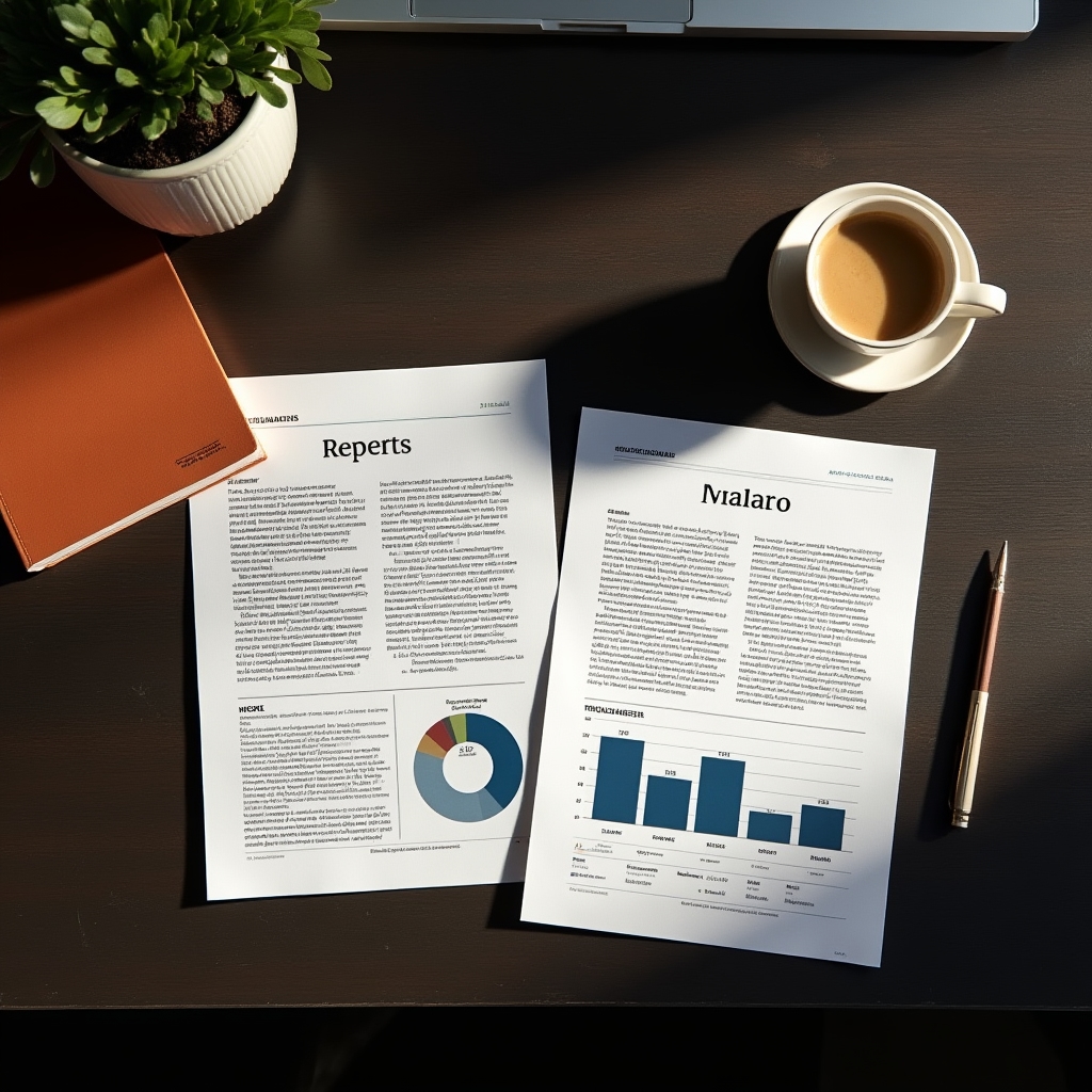
Participants are welcome to bring an anonymized, real report from their own organization, stripped of anything sensitive. For anyone who would rather not use internal material, or whose organization has restrictions on that, we provide a set of sample reports drawn from common formats: an operations dashboard, a marketing summary, and a program status update. Either way, the exercise is the same: identify the intended takeaway, decide whether the current version communicates it, and rebuild the page.
The goal is not to critique anyone's original work. Most reports we've worked with are accurate and carefully assembled. The rebuild exercise is about reordering attention, not correcting mistakes.
Facilitation
The people running the room
A small team facilitates each cohort. Click a name to read more about their background.
Elena spent several years producing monthly operational reports for a mid-size logistics company before moving into internal training. She leads most sessions and focuses on the spreadsheet-triage portion of the workshop, drawing on years of watching which findings actually changed a decision and which ones got skimmed past.
Marcus has a background in editorial design and spent time laying out printed reports for nonprofit annual summaries. He leads the chart-selection and one-page layout portions, with an emphasis on restraint: fewer colors, fewer chart types, and more white space than most first drafts include.
Priya previously coached internal presenters ahead of board meetings and client reviews. She runs the live presentation portion of session two, working with participants on pacing, framing a takeaway before diving into detail, and handling questions from an audience that is skeptical of anything that looks like a chart.